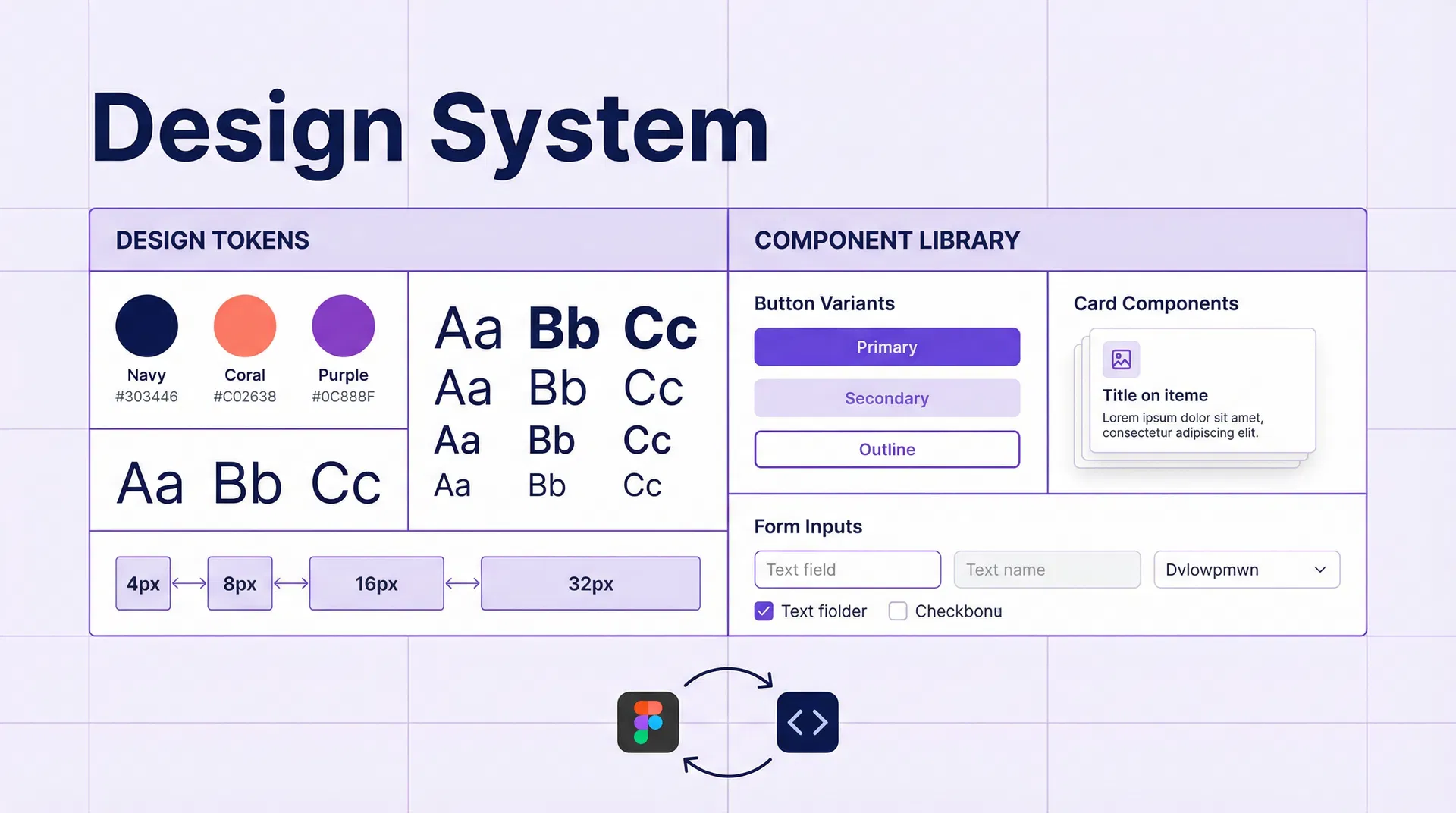
# How to Implement a Design System in HubSpot CMS and WordPress: Agency Guide for 2026 ## Table of Contents - [Introduction](#introduction) - [What is a Design System and Why It Matters](#what-is-a-design-system-and-why-it-matters) - [Components of a Design System](#components-of-a-design-system) - [Design Tokens: The Foundation of the System](#design-tokens-the-foundation-of-the-system) - [Implementing a Design System in HubSpot CMS](#implementing-a-design-system-in-hubspot-cms) - [Implementing a Design System in WordPress](#implementing-a-design-system-in-wordpress) - [Figma as the Design Source of Truth](#figma-as-the-design-source-of-truth) - [Synchronising Tokens Between Figma and Code](#synchronising-tokens-between-figma-and-code) - [Design System Documentation](#design-system-documentation) - [Maintenance and Evolution of the System](#maintenance-and-evolution-of-the-system) - [Frequently Asked Questions](#frequently-asked-questions) - [Conclusion](#conclusion) - [References](#references) --- ## Introduction A design system is the invisible infrastructure that makes high-performance B2B websites consistent, scalable and easy to maintain. In 2026, agencies working with HubSpot CMS and WordPress have adopted design systems as a working standard for their clients. Without a design system, every new page is an opportunity to introduce inconsistencies: a button with a different border radius here, a slightly different text colour there, spacing that follows no scale. With a design system, all visual elements follow the same rules and development is faster and more predictable. --- ## What is a Design System and Why It Matters A design system is a collection of reusable components, guided by clear standards, that can be assembled to build any number of applications. It includes: - **Design tokens:** The fundamental values of the design (colours, typography, spacing, shadows). - **Components:** The building blocks of the interface (buttons, forms, cards, navigation). - **Patterns:** Combinations of components that solve recurring UX problems. - **Documentation:** Usage guides for components and patterns. ### Why It Matters for B2B Agencies **Visual consistency.** All elements of the website follow the same design rules, creating a coherent experience for the user. **Development speed.** Developers do not have to reinvent the wheel on every project. Components are already built and documented. **Simplified maintenance.** Changing the brand's primary colour requires modifying a single token, not searching and replacing across hundreds of CSS files. **Design-development collaboration.** Designers and developers speak the same language. Figma tokens synchronise with code. --- ## Components of a Design System ### Level 1: Foundations Foundations are the most basic values of the system: | Category | Examples | |---|---| | Colour | Brand palette, semantic colours (success, warning, error), greyscale | | Typography | Font families, size scale, weights, line heights | | Spacing | Spacing scale (4px, 8px, 16px, 24px, 32px, 48px, 64px) | | Shadows | Shadow scale (sm, md, lg, xl) | | Borders | Border radius, border width | | Iconography | Icon library, sizes, styles | ### Level 2: Components Components are the building blocks of the interface: - **Atoms:** Buttons, inputs, labels, icons, badges. - **Molecules:** Forms, cards, alerts, tooltips. - **Organisms:** Navigation, footer, hero sections, content grids. ### Level 3: Patterns Patterns are solutions to recurring UX problems: - Contact form with validation. - Pricing table with CTA. - Hero section with image and form. - Case study grid. --- ## Design Tokens: The Foundation of the System Design tokens are the atomic values of the design system, expressed as named variables: ```css /* Design tokens in CSS Custom Properties */ :root { /* Brand colours */ --color-brand-primary: #1a1a2e; --color-brand-secondary: #e94560; --color-brand-accent: #0f3460; /* Semantic colours */ --color-success: #10b981; --color-warning: #f59e0b; --color-error: #ef4444; --color-info: #3b82f6; /* Greyscale */ --color-gray-50: #f9fafb; --color-gray-100: #f3f4f6; --color-gray-200: #e5e7eb; --color-gray-300: #d1d5db; --color-gray-400: #9ca3af; --color-gray-500: #6b7280; --color-gray-600: #4b5563; --color-gray-700: #374151; --color-gray-800: #1f2937; --color-gray-900: #111827; /* Typography */ --font-family-sans: 'Inter', system-ui, sans-serif; --font-family-mono: 'JetBrains Mono', monospace; --font-size-xs: 0.75rem; /* 12px */ --font-size-sm: 0.875rem; /* 14px */ --font-size-base: 1rem; /* 16px */ --font-size-lg: 1.125rem; /* 18px */ --font-size-xl: 1.25rem; /* 20px */ --font-size-2xl: 1.5rem; /* 24px */ --font-size-3xl: 1.875rem; /* 30px */ --font-size-4xl: 2.25rem; /* 36px */ --font-size-5xl: 3rem; /* 48px */ /* Spacing (4px scale) */ --spacing-1: 0.25rem; /* 4px */ --spacing-2: 0.5rem; /* 8px */ --spacing-3: 0.75rem; /* 12px */ --spacing-4: 1rem; /* 16px */ --spacing-6: 1.5rem; /* 24px */ --spacing-8: 2rem; /* 32px */ --spacing-12: 3rem; /* 48px */ --spacing-16: 4rem; /* 64px */ --spacing-24: 6rem; /* 96px */ /* Shadows */ --shadow-sm: 0 1px 2px 0 rgb(0 0 0 / 0.05); --shadow-md: 0 4px 6px -1px rgb(0 0 0 / 0.1), 0 2px 4px -2px rgb(0 0 0 / 0.1); --shadow-lg: 0 10px 15px -3px rgb(0 0 0 / 0.1), 0 4px 6px -4px rgb(0 0 0 / 0.1); --shadow-xl: 0 20px 25px -5px rgb(0 0 0 / 0.1), 0 8px 10px -6px rgb(0 0 0 / 0.1); /* Borders */ --radius-sm: 0.25rem; /* 4px */ --radius-md: 0.375rem; /* 6px */ --radius-lg: 0.5rem; /* 8px */ --radius-xl: 0.75rem; /* 12px */ --radius-2xl: 1rem; /* 16px */ --radius-full: 9999px; } ``` --- ## Implementing a Design System in HubSpot CMS HubSpot CMS has a native theming system that integrates perfectly with design tokens. ### HubSpot Theme Structure ``` theme/ ├── css/ │ ├── tokens.css # Design tokens │ ├── base.css # Base styles (reset, typography) │ ├── components/ │ │ ├── buttons.css │ │ ├── forms.css │ │ ├── cards.css │ │ └── navigation.css │ └── utilities.css # Utility classes ├── modules/ │ ├── hero/ │ ├── cta-section/ │ ├── feature-grid/ │ └── testimonials/ ├── templates/ │ ├── home.html │ ├── landing.html │ └── blog-post.html └── theme.json # Theme configuration ``` ### Configuring Design Tokens in theme.json ```json { "label": "My B2B Theme", "preview_path": "./templates/home.html", "screenshot_path": "./images/screenshot.png", "settings": [ { "type": "group", "label": "Colours", "name": "colors", "settings": [ { "type": "color", "label": "Primary colour", "name": "primary_color", "default": "#1a1a2e" }, { "type": "color", "label": "Accent colour", "name": "accent_color", "default": "#e94560" } ] }, { "type": "group", "label": "Typography", "name": "typography", "settings": [ { "type": "font", "label": "Heading font", "name": "heading_font", "default": { "font": "Inter", "font_set": "GOOGLE" } } ] } ] } ``` ### Accessible Button Module in HubSpot CMS ```html { "label": "CTA Button", "icon": "custom_widget", "categories": ["components"], "fields": [ { "name": "button_text", "label": "Button text", "type": "text", "default": "Request demo" }, { "name": "button_url", "label": "Button URL", "type": "link", "default": { "url": { "href": "/contact" } } }, { "name": "button_style", "label": "Style", "type": "choice", "choices": [["primary", "Primary"], ["secondary", "Secondary"], ["outline", "Outline"]], "default": "primary" } ] } {{ module.button_text }} ``` --- ## Implementing a Design System in WordPress In WordPress, the design system is implemented through the theme and Gutenberg blocks. ### Configuring Design Tokens in theme.json (WordPress) ```json { "$schema": "https://schemas.wp.org/trunk/theme.json", "version": 3, "settings": { "color": { "palette": [ { "slug": "brand-primary", "color": "#1a1a2e", "name": "Primary" }, { "slug": "brand-secondary", "color": "#e94560", "name": "Secondary" }, { "slug": "brand-accent", "color": "#0f3460", "name": "Accent" } ], "gradients": [], "duotone": [] }, "typography": { "fontFamilies": [ { "fontFamily": "Inter, system-ui, sans-serif", "slug": "inter", "name": "Inter", "fontFace": [ { "fontFamily": "Inter", "fontWeight": "400 700", "fontStyle": "normal", "src": ["file:./fonts/inter-variable.woff2"] } ] } ], "fontSizes": [ { "slug": "sm", "size": "0.875rem", "name": "Small" }, { "slug": "base", "size": "1rem", "name": "Base" }, { "slug": "lg", "size": "1.125rem", "name": "Large" }, { "slug": "xl", "size": "1.25rem", "name": "Extra large" }, { "slug": "2xl", "size": "1.5rem", "name": "2XL" }, { "slug": "3xl", "size": "1.875rem", "name": "3XL" }, { "slug": "4xl", "size": "2.25rem", "name": "4XL" } ] }, "spacing": { "spacingSizes": [ { "slug": "1", "size": "0.25rem", "name": "1" }, { "slug": "2", "size": "0.5rem", "name": "2" }, { "slug": "4", "size": "1rem", "name": "4" }, { "slug": "8", "size": "2rem", "name": "8" }, { "slug": "16", "size": "4rem", "name": "16" } ] } } } ``` ### Creating Custom Gutenberg Blocks ```javascript // blocks/cta-section/index.js import { registerBlockType } from '@wordpress/blocks'; import { InspectorControls, RichText, MediaUpload } from '@wordpress/block-editor'; import { PanelBody, TextControl, SelectControl } from '@wordpress/components'; registerBlockType('emovere/cta-section', { title: 'CTA Section', category: 'emovere-blocks', attributes: { heading: { type: 'string', default: 'Section title' }, subheading: { type: 'string', default: 'Descriptive subtitle' }, buttonText: { type: 'string', default: 'Request demo' }, buttonUrl: { type: 'string', default: '/contact' }, style: { type: 'string', default: 'primary' } }, edit({ attributes, setAttributes }) { return ( <> setAttributes({ buttonUrl: value })} /> setAttributes({ style: value })} />
setAttributes({ heading: value })} /> setAttributes({ subheading: value })} /> {attributes.buttonText}
); }, save({ attributes }) { return (
{attributes.buttonText}
); } }); ``` --- ## Figma as the Design Source of Truth Figma is the standard tool for designing design systems in 2026. The integration between Figma and code is achieved through design tokens. ### Recommended Structure in Figma ``` 📁 Design System ├── 📄 Tokens │ ├── Colours │ ├── Typography │ ├── Spacing │ └── Shadows ├── 📄 Components │ ├── Buttons │ ├── Forms │ ├── Cards │ └── Navigation ├── 📄 Patterns │ ├── Hero sections │ ├── Feature sections │ └── Pricing sections └── 📄 Templates ├── Home ├── Landing page └── Blog post ``` --- ## Synchronising Tokens Between Figma and Code Token synchronisation between Figma and code can be automated with tools such as Style Dictionary or Tokens Studio: ```javascript // style-dictionary.config.js module.exports = { source: ['tokens/**/*.json'], platforms: { css: { transformGroup: 'css', buildPath: 'src/css/', files: [{ destination: 'tokens.css', format: 'css/variables', options: { outputReferences: true } }] }, hubspot: { transformGroup: 'css', buildPath: 'theme/css/', files: [{ destination: 'tokens.css', format: 'css/variables' }] } } }; ``` --- ## Design System Documentation Documentation is the most important and most neglected part of a design system. Without documentation, components are not used correctly. **Documentation tools:** | Tool | Type | Price | Best For | |---|---|---|---| | Storybook | Self-hosted | Free | React/Vue/Angular components | | Zeroheight | SaaS | From $149/month | Design documentation | | Supernova | SaaS | From $99/month | Figma-code synchronisation | | Notion | SaaS | From $8/month | Pattern documentation | --- ## Maintenance and Evolution of the System A design system is a living product that evolves with the brand and products. To maintain it: 1. **Semantic versioning.** Use semver to version the system (major.minor.patch). 2. **Changelog.** Document all changes in a CHANGELOG.md. 3. **Contribution process.** Define how new components are proposed and approved. 4. **Periodic audits.** Review the system every quarter to remove obsolete components. 5. **Visual testing.** Use tools such as Chromatic or Percy to detect visual regressions. --- ## Frequently Asked Questions **How long does it take to create a design system from scratch?** For a standard B2B website, creating a complete design system (tokens, basic components, documentation) takes between 4 and 8 weeks. A more complete system with patterns and templates can take 3–6 months. **Is it necessary to use Figma for a design system?** No, but it is the most popular tool and has the best integration with development tools. Alternatives such as Sketch or Adobe XD also work. **Can I use Tailwind CSS as a design system?** Tailwind CSS is an excellent foundation for a design system, but it is not a complete design system. You need to add components, patterns and documentation on top of Tailwind. **How do I manage multiple brands with the same design system?** Design tokens allow multiple themes to be created on the same component base. Each brand has its own set of tokens that overrides the base tokens. **Are design systems only for large companies?** No. Even the smallest B2B websites benefit from a simplified design system. A basic set of CSS tokens and 10–15 reusable components already provides consistency and development speed. --- ## Conclusion A design system is the most profitable investment a B2B agency can make in 2026. The visual consistency, development speed and ease of maintenance it provides translate directly into more profitable projects and more satisfied clients. At Emovere we develop design systems for B2B websites in HubSpot CMS and WordPress, from design tokens to components and documentation. Contact our team for a free consultation. --- ## References [1] Brad Frost — Atomic Design. https://atomicdesign.bradfrost.com [2] Style Dictionary — Documentation. https://amzn.github.io/style-dictionary/ [3] Storybook — Documentation. https://storybook.js.org/docs [4] HubSpot — CMS Theme Development. https://developers.hubspot.com/docs/cms/building-blocks/themes [5] WordPress — Theme.json Reference. https://developer.wordpress.org/block-editor/reference-guides/theme-json-reference/